Behind the Design of 2025 Topps Chrome® Deadpool
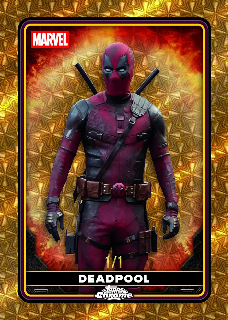
When Topps brought Deadpool into the Chrome lineup for 2025, the creative tension was obvious from the start. Chrome is built on precision. It’s clean, premium, and structured. Deadpool is built on disruption. He breaks the fourth wall, mocks his own storylines, and thrives in chaos.
The challenge was not choosing one identity over the other. It was finding a way to let both live on the same card without compromise.
2025 Topps Chrome Deadpool blends the clean, premium structure of Chrome with Deadpool’s self-aware chaos. By anchoring the base design in disciplined typography and composition, Topps created space for subtle visual gags, bold imagery, and cinematic energy — resulting in a set that feels polished, playful, and unmistakably Deadpool.
For Topps Art Director Arvin Catriz, the solution for Deadpool on Chrome began with the character himself.
“Deadpool’s personality really drove the visual approach,” he explained. “Even though Chrome has a very clean and premium structure, we looked for ways to let the design feel a little self-aware. That meant playing with unexpected graphic elements, subtle visual gags, and moments where the layout feels like it’s slightly ‘interrupting’ itself. The goal was to keep the polish of Chrome while letting Deadpool’s irreverent tone peek through in small ways.”
That idea of self-awareness became the north star for the product. Chrome did not need to be reinvented. It needed to be slightly nudged. The structure would remain intact, while the personality would surface in controlled, intentional ways.
Building Something New for Topps Chrome Deadpool
Translating Deadpool onto wax meant respecting the fundamentals of trading card design first. Clarity, hierarchy, and composition could not be sacrificed for the sake of a joke.
“That was probably the biggest challenge,” Catriz said. “Deadpool is chaotic by nature, but trading cards still need clarity and structure. The approach was to build a strong, disciplined foundation, clean typography, clear hierarchy, and balanced composition, and then let the humor live within that framework. When the base design is controlled, the chaotic or comedic elements land better because they feel intentional rather than messy.”
By anchoring the base set in discipline, the team created space for Deadpool’s humor to breathe. The visual gags and tonal winks do not overwhelm the card; they feel deliberate and smartly designed.
That same philosophy guided how the Chrome finish itself was used. Rather than adding more visual noise, the team leaned into contrast.
“Chrome already gives you that sleek, reflective finish, so we leaned into bold imagery and strong color blocking to give Deadpool presence on the card,” Catriz explained. “The chaos comes more from the attitude of the design and the imagery, rather than cluttering the layout. It’s controlled energy rather than visual noise.”

Capturing Deadpool on Film
Because the set centers on the cinematic portrayal of Deadpool, the imagery had to carry the right tone before any design elements were layered in. The personality had to be present in the photography itself.
“A lot of it came down to image selection and framing,” Catriz said. “We focused on moments that captured the character’s attitude, expressive poses, action beats, and moments that felt very ‘Deadpool.’ Once you start with imagery that already carries that personality, the design can support it instead of trying to manufacture it.”
Certain visual details were non-negotiable, of course, Catriz explained.
“The suit itself is so iconic, so highlighting the texture, color, and silhouette of the costume was important. Beyond that, we looked for moments that represent Deadpool’s mix of action and humor, those scenes where the character feels larger than life but still very self-aware.”
Those action-heavy scenes presented their own design test. Chrome works best when it feels clean and collectible, even when the imagery is dynamic.
“It’s really about restraint in the layout,” Catriz said. “The imagery can be dynamic and intense, but the surrounding design needs to stay clean so the card remains readable and visually balanced. Chrome works best when the design gives the image room to breathe, so we tried to frame those action moments in a way that still felt crisp and collectible.”
The result is a card that feels energetic without feeling crowded, cinematic without losing clarity.
Inserts, Mini-Worlds, and Easter Eggs in Topps Chrome Deadpool
While the base set establishes the tone, inserts allowed the team to lean further into Deadpool’s personality. For Catriz, a few subsets stood out as creative highlights.
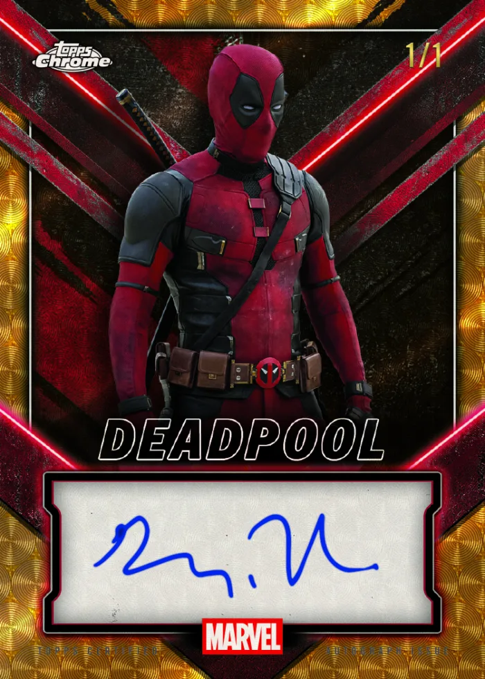
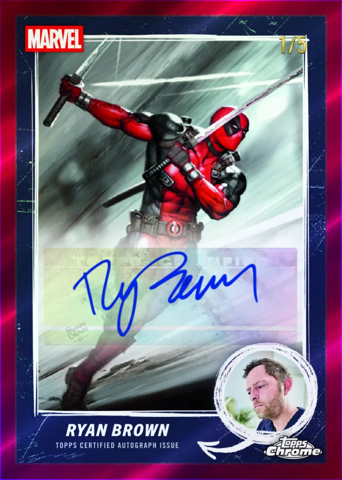
“I have a few, but the standouts are the Inscription Dual Book Card and Best Bubs,” he said. “Those two designs really leaned hardest into Deadpool’s personality and sense of humor. It gave us a little more freedom to push the tone and have fun with the visuals. Inserts are a great place to experiment because they can feel like their own mini-world inside the product, and that’s where we could really explore the playful side of the character.”
Those mini-worlds created room for exploration while keeping the overall product cohesive. They also created opportunities for deeper fan engagement. Deadpool collectors expect layered references and hidden jokes, and the design team approached that expectation intentionally.
“Deadpool fans expect that kind of detail, so we tried to build small things into the design that reward a closer look,” Catriz said. “Some of it lives in the background graphics or small typographic moments, and some references are tied to specific scenes or character beats from the films. Nothing that overwhelms the card, but enough that collectors might notice something new the second or third time they look at it.”
That final point captures what makes 2025 Topps Chrome Deadpool work so well. The product does not try to shout. It invites a second look, and then a third.
By building a disciplined foundation and allowing Deadpool’s irreverence to surface in measured ways, the team created a set that feels unmistakably Chrome while staying true to the character. It’s polished without feeling sterile; playful without feeling messy. It’s a controlled collision of clarity and chaos — exactly the kind of balance a fourth-wall-breaking antihero deserves.
2025 Topps Chrome® Deadpool Collector FAQs
- Are there special inserts in 2025 Topps Chrome® Deadpool?
- Yes. Highlighted inserts include the Inscription Dual Book Card and Best Bubs. These subsets lean further into Deadpool’s humor and visual experimentation while maintaining Chrome’s premium feel.
- Is 2025 Topps Chrome® Deadpool based on the films?
- The imagery centers on the cinematic portrayal of Deadpool, focusing on expressive poses, action scenes, and iconic suit details that reflect the character’s on-screen personality.
- How does Chrome’s finish impact the Deadpool design?
- The reflective Chrome surface adds sleekness and depth. Designers used bold color blocking and clean framing to prevent visual clutter, ensuring readability even during dynamic action scenes.
- Are there hidden details in 2025 Topps Chrome® Deadpool?
- Yes. The design includes subtle background graphics and typographic Easter eggs that reward collectors who take a closer look — an intentional nod to Deadpool fans.
Key Facts
- 2025 Topps Chrome® Deadpool blends Chrome structure with cinematic Deadpool imagery
- Design anchored in clean typography and balanced composition
- Inserts like Inscription Dual Book Card and Best Bubs push personality further
- Subtle Easter eggs reward repeat viewing
- Controlled contrast defines the product’s visual identity
More Topps Marvel
-
2026 Topps Finest Fantastic Four 65th Anniversary Product History
-

2026 Topps Brooklyn Collection | Behind the Design
-

2025 Topps Chrome® Deadpool | Behind the Design
-
Marvel The Collector Product History
-
Marvel Comic Book Heroes 1975 Golden Anniversary Product History
-
2025 Marvel Comic Book Heroes 1975 Golden Anniversary Checklist Spotlight