The Inspiration Behind 2025 Topps Black and White Baseball
The 2025 Topps Black and White Baseball set brings a striking, minimalist beauty to collectors — a pure photography-driven experience available exclusively through Topps.com. Now an annual online exclusive, Black & White Baseball stands out in the Topps portfolio for its simplicity, artistry, and focus on emotion over embellishment.
2025 Topps Black and White Baseball is a photo-driven, minimalist release with deep blacks, crisp whites, and a premium matte finish. The set emphasizes negative space, on-card autos, and a clever color-pop approach to parallels, heightening the surprise when a vivid chase emerges from a monochrome pack.
For Topps Art Director Thomas Regan, the guiding principle of simplicity shaped every decision. “We wanted to strip away everything that usually competes for attention in a sports card set,” Regan explained. “We focused entirely on what makes baseball photography powerful: contrast, composition, and the raw emotion of the game.”
That purity of vision is what defines Topps Black and White Baseball. Rather than relying on graphics, textures, or complex color palettes, the design finds its strength in light, tone, and detail.
“Without color, every design choice has to work harder,” Regan said. “The photography needs to tell the story all on its own. If the photo isn’t perfect, you’ll know right away.”

A Study in Restraint
Creating something simple — and making it feel premium — proved to be one of the biggest design challenges for 2025 Topps Black and White Baseball.
“Without color, we had to be particular about photo selection,” Regan said. “Only images with high contrast and strong composition translate well to black and white. We wanted the photography to be the hero, which meant stripping away design elements.” As the team eliminated things around the edges of the designs, the core ethos emerged. “Every time we removed something unnecessary, the photography stood out,” Regan said.
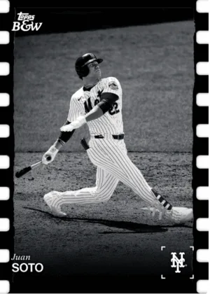
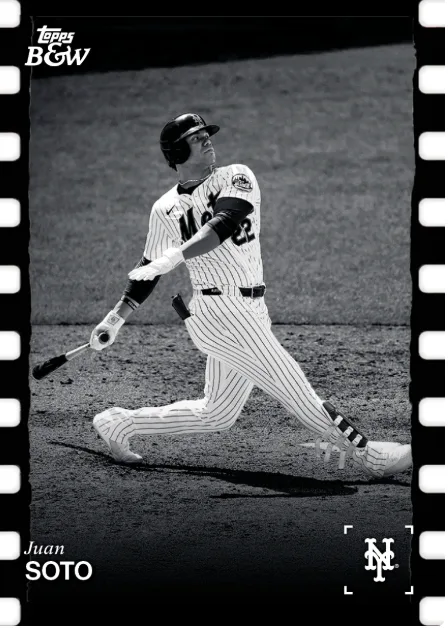
That mindset led to countless hours of discussion and refinement. “Our editorial team did an incredible job selecting photos that captured players’ personalities, heroic plays, and unique poses,” Regan explained. “We sat in a conference room debating certain photos to make sure we nailed each selection. Juan Soto’s image almost didn’t make it. The team couldn’t decide which crop worked best. We went back and forth. In hindsight, the crop we landed on was the obvious choice and became one of the best-looking cards in the set.”
For Regan, those moments of creative back-and-forth were essential to finding balance.
“We knew we couldn’t hide behind design tricks,” he said. “Every single photo had to carry weight on its own. When you remove color, borders, and extra elements, there’s nowhere for a weak image to hide.”
Old-School Inspiration
While Topps Black & White Baseball feels refreshingly modern, its roots are firmly planted in baseball card history. “The 1953 Bowman black and white cards were a huge influence,” Regan explained. “That set relied entirely on photography.
With no player names or borders, that classic run served as great inspiration. “The posed and candid shots in that set, and the confidence to let photos speak for themselves, influenced how we approached Topps Black & White Baseball,” Regan said.
Regan and his team didn’t just reference those designs — they adopted the same philosophy. “The 1953 Bowman set had this confidence to just say, ‘We trust the photograph.’ That’s exactly what we wanted to do here,” he explained. “You never want to over-design a set like this. You need to make sure the photography tells the story.”
Balancing Light, Texture, and Tone
Despite its minimalist presentation, Black & White Baseball demanded an exceptional level of technical precision. “The biggest challenge was identifying which elements could be eliminated without losing impact,” Regan said. “Once we landed on the design, we spent countless hours perfecting each image’s contrast and tonal range so it would feel dynamic in black and white, not flat.”
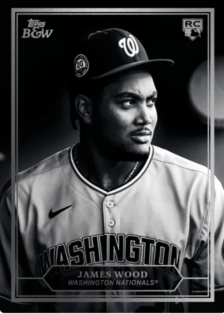
Even the physical texture of the cards was treated with intent. “Topps Baseball usually features intricate designs with ornate elements and beautiful textures,” Regan said. “This set stands out as a simplified baseball release. When you hold each card, you’ll notice a matte finish and rich, deep blacks in the photos. The white player name and Topps B&W logos contrast sharply against that photography, so everything feels intentional and premium.”
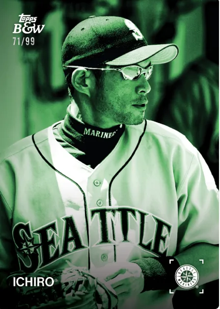
One of the most exciting evolutions came in the form of the parallels. “The parallels have evolved over the years, but the 1-of-1 has always been full color,” Regan explained. “Starting last year, we flipped the script and introduced color parallels so collectors could feel the excitement of pulling a vibrant card out of a pack of black and white. It’s the surprise moment that makes the experience even more rewarding.”
Designing Topps Baseball in Negative Space
When it came to insert cards, Regan found inspiration in minimalism once again.
“The Black & White on-card autos were a first for this collection,” he said. “Much like we did with the base cards and subsets, we identified only the necessary elements and landed on a clean white design. We designed with negative space in mind. The player image and signature are the focus of these cards.”
That principle carried across the entire set. “When we designed these cards, we asked ourselves constantly, does this detail add meaning or does it distract?” Regan explained. “That discipline is what makes this product feel so different from everything else we do.”

Capturing Emotion in 2025 Topps Black and White Baseball
Ultimately, Topps Black and White Baseball isn’t just about design — it’s about emotion. “I hope collectors feel the premium quality immediately,” Regan said. “We returned to the earlier years of Topps Black and White Baseball with that matte finish, and it makes the cards feel more like photographic prints than typical sports cards. I want them to slow down and really look at each image. I hope they feel the thrill of pulling one of the colored parallels out of a pack of cards.”
Reflecting on the project, Regan emphasized both the creative challenge and the reward. “I’m proud of the team’s effort to bring one of my favorite products to life,” he said. “The team spent countless hours perfecting the contrast and tonal balance to make these cards feel timeless.”
For Regan, 2025 Topps Black and White Baseball is proof that great design doesn’t have to shout — it just has to speak clearly.
“Sometimes,” he said, “you don’t need color to make an image come alive. You just need to trust the photo.”
2025 Topps Black and White Baseball Design FAQs
- How were images for 2025 Topps Black and White Baseball selected?
- Only high-contrast, strong-composition shots made the cut. The team iterated on crops and poses to ensure every card could stand alone without decorative crutches.
- What inspired the design of 2025 Topps Black and White Baseball?
- The set was inspired by vintage black-and-white releases — especially 1953 Bowman — where photography told the story without heavy graphics. The team applied that trust-the-photo ethos to a modern build.
- What’s the approach to 2025 Topps Black and White autographs?
- On-card autographs are presented with intentional negative space so the signature and portrait remain the focus — clean, modern, and uncluttered.
- How are parallels handled in this set?
- Parallels “flip the script” by introducing vibrant color amidst monochrome, creating a surprise hit that feels distinct when opened from a black-and-white pack.
- What stands out about the card stock and finish?
- A matte finish deepens blacks and sharpens whites, giving photos a gallery-print feel. White names and logos pop against the imagery, enhancing legibility and premium perception.
Key Facts
- Photo-first, minimalist ethos
- Matte stock + bold white marks amplify contrast and feel
- Parallels inject strategic color for a memorable pull
- On-card autos framed with negative space
- Vintage B/W heritage informs modern execution