Revitalizing the 1977 Topps Design
Each year, Topps Heritage Baseball serves as both a tribute and a reinterpretation, bringing one of the brand’s classic designs into the modern era while preserving the details that made it iconic in the first place. For 2026 Topps Heritage Baseball, that spotlight turns to the 1977 Topps Baseball set — a design remembered for its distinctive layout and understated style.
Tasked with translating that look for today’s collectors was Topps Graphic Designer Jessie Bischer, whose work reflects a careful balance between historical accuracy and contemporary production.
The 2026 Topps Heritage Baseball set revives the iconic 1977 Topps design, blending vintage aesthetics with modern production. Featuring team-specific layouts, bold color schemes, and retro-inspired photography, the set recreates the look and feel of 1970s cards while introducing new inserts like The Enterprise for today’s collectors.
What Makes 1977 Topps Baseball Distinct?
From a design perspective, the 1977 Topps set stands apart in subtle but meaningful ways. It’s not immediately loud or flashy, but it carries a unique visual identity that has endured for decades.
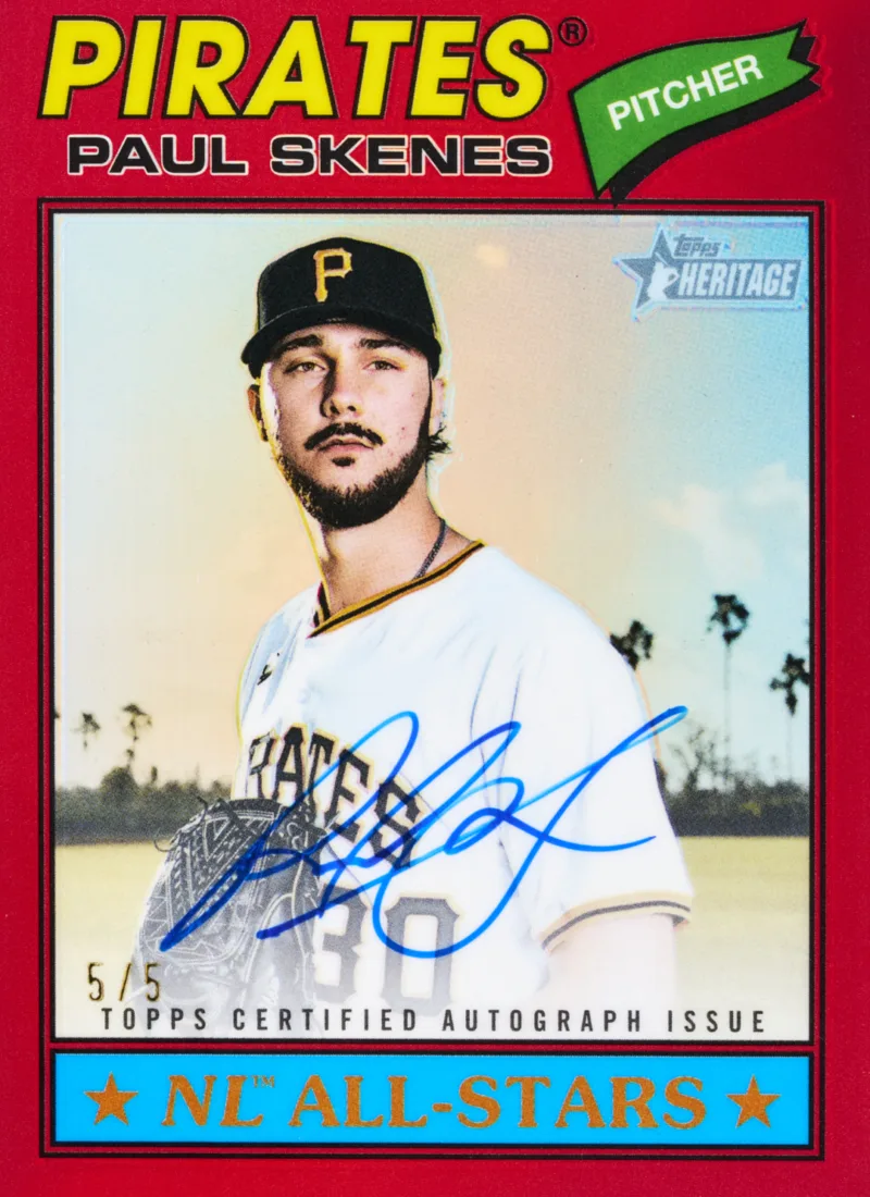
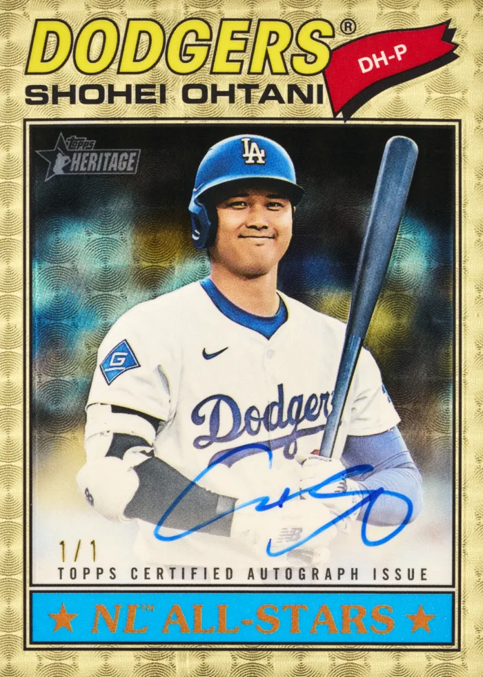
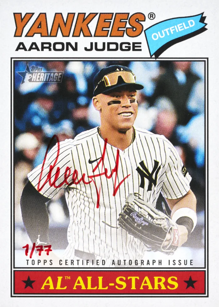
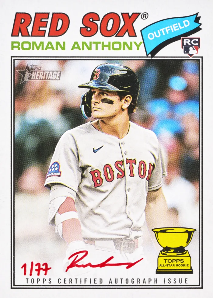
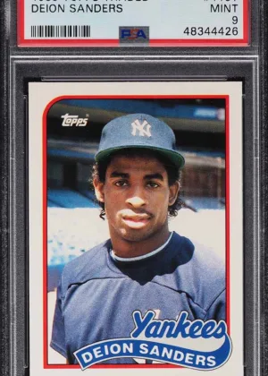
“The 1977 design is a bit quirky with the small pennant shape tilted in the open area in the right corner,” Bischer explains. “In terms of layout, it is similar to the 1971 black border where all elements are at the top, yet it doesn’t feel top-heavy.”
That sense of balance is critical to the design’s success, concentrating information while still making sure nothing gets too busy. Preserving that equilibrium was essential in adapting the design for Heritage, where even small shifts in spacing or proportion could alter the overall feel. At the same time, the simplicity of the layout allows other elements, like color and typography, to stand out more prominently, reinforcing the card’s clean but recognizable identity.
Adapting 1977 Topps for 2026 Heritage Baseball
Obviously, visual accuracy is critical when bringing an old design into the modern Hobby, but that also means understanding how those original cards were produced. For the Heritage team, that meant incorporating both design techniques and material choices that evoke the 1970s while still meeting modern standards.
“We add some vintage effects to the designs to visually age them, as well as printing on a recycled paper stock to add to the look of the ’70s,” Bischer says. “This stock both looks and feels genuine to early baseball cards. Also, the photography is retouched with a special effect that mimics an aged look of vintage photography.”
The aging effects soften the overall presentation, while the paper stock introduces a tactile authenticity that collectors can feel immediately. Even the photography plays a role, with subtle adjustments that replicate the tonal qualities of older images. Together, these elements ensure that the experience of holding a 2026 Topps Heritage Baseball card evokes that same feeling collectors felt back in 1977.
That commitment to authenticity also introduces challenges, particularly when it comes to recreating the variability that defined the original set. Unlike many modern designs that rely on uniform templates, the 1977 cards had a lot more variation.
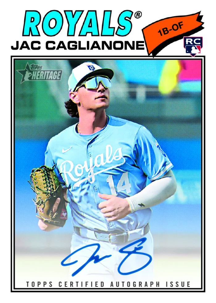
“Matching theme colors and fonts for each team is a challenge we run into every year,” Bischer explains. “In the 1970s, the graphics were made individually for each card. Each team has its own unique color combination in the title, along with varying sizes of texts.”
Rebuilding that level of customization required significant effort across the entire checklist of teams. “It was an extra lift for the team to set up all 30-plus team frames, but the 1977 design would not be the same without its various bold and colorful titles,” Bischer says.
Even beyond layout and color, the design process extends into photography selection, another area where the team deliberately mirrored the past.
“You’ll notice that most player imagery used in Heritage is often posed shots,” Bischer says. “This is also done to emulate the style of the cards in the 1970s, where action shots were almost never used.” It’s a subtle but important distinction. While modern cards often emphasize action and motion, Heritage leans into the composed, studio-style imagery of the era.
“This might go unnoticed by most, but the team goes the extra mile to choose photographs that look like they belong on a card from 1977.” Research is the key to that process, though it can be painstaking. The whole team goes to great lengths to ensure that every element, from spacing to color to imagery, is rooted in the source material.
“It can be tedious work,” Bischer says, “but it’s worth it in the end to create a result that honors the original set that is loved by so many.”
The Role of Color, Typography, and Creative Inserts in Topps Heritage
A defining feature of the 1977 set is its use of bold, straightforward color and limited typography. At the time, designers were working with fewer tools and a much simpler printing process, which shaped the overall aesthetic in ways that still resonate today.
“When these cards were produced in 1977, there were only a handful of typefaces to choose from,” Bischer explains. Because of those limitations, the 2026 Topps Heritage design leans into clarity and contrast.
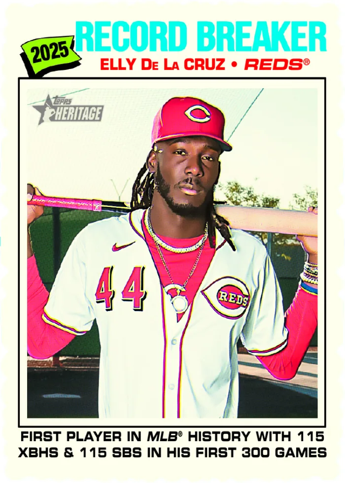
“Many of the colors in this year’s set were built with simplicity in mind,” she says, “as they would have done in the ’70s, using only plain yellows, magentas, etc. The bright colors against the pure white background give the cards a look that’s bold, clean, and timeless.”
That simplicity allows the design to remain visually striking without feeling overly complicated, which is a key reason it continues to translate well decades later. And while the base set remains closely tied to its historical inspiration, inserts provide an opportunity to expand creatively within the same time period.
“My favorite design to work on this year was The Enterprise,” Bischer says. “1977 was the year the NASA space shuttle by the same name was launched into orbit, and this card pays homage to that moment in history by highlighting players with ‘out of this world’ abilities.”
Drawing from the broader cultural context of the late 1970s, the design incorporates influences beyond baseball.
“A lot of my inspiration for this design came from 1970s sci-fi comic book art,” Bischer explains. “The frame also mimics the inner workings of a space shuttle, as a call back to the original 1977 voyage.” The result is an insert that feels consistent with the era while still offering something visually distinct within the product.
Connecting Generations Through Topps Heritage Baseball
At its core, Topps Heritage is about more than recreating a past design. It’s about preserving a shared experience and making it accessible to a new generation of collectors, while still resonating with those who remember the original.
“It means a lot to me to be able to bring the 1977 design back to life in 2026, honoring the trading cards of the past,” Bischer says. “The Heritage brand is a truly valuable part of our company and opens new doorways for families and collectors to connect across generations.”
That perspective underscores the significance of Heritage within The Hobby. By combining detailed research, careful execution, and a deep respect for its source material, the 2026 Topps Heritage Baseball set reinforces the legacy of 1977, ensuring that its design continues to resonate for collectors both old and new.
2026 Topps Heritage Baseball Collector FAQs
- What design does 2026 Topps Heritage Baseball use?
- The set is based on the 1977 Topps Baseball design, known for its pennant detail, bold colors, and clean layout. It has been carefully recreated using modern production while maintaining vintage authenticity.
- What makes Topps Heritage different from other sets?
- Topps Heritage focuses on recreating classic card designs from past decades, using vintage-inspired materials, photography styles, and layouts to deliver a nostalgic collecting experience.
- What is “The Enterprise” insert?
- The Enterprise is a 2026 Heritage insert inspired by the 1977 NASA space shuttle launch, featuring sci-fi design elements and players with standout performances.
- Why are posed photos used in Topps Heritage?
- Posed photography reflects the style of 1970s baseball cards, helping recreate the authentic look and feel of the original 1977 set.
Key Facts
- Product: 2026 Topps Heritage baseball
- Design Inspiration: 1977 Topps Baseball design
- Style Markers: Team-specific color and typography variations, vintage-style paper stock and aging effects
- Image Emphasis: Posed photography over action shots
- Key Insert: The Enterprise
More Topps Baseball
-
Vote on the 2026 MLB Topps NOW Player of the Week: Mar. 30 – Apr. 5
-
Bowman Red RC Redemption Returns Soon
-
Topps NOW® Brand History | 10-Year Anniversary
-

TOPPS NOW® Photogs Tell All | 10-Year Anniversary Celebration
-
How 1948 Bowman Football Paved the Path for NFL Cards
-
1956 Topps Football | The Start of a Hobby Tradition
-
Office Hours | Sports Switchers