Behind the Design of Bowman U Chrome Basketball
In 2023-24 Bowman U Chrome Basketball every card tells a story of dynamic design, vibrant colors, and the essence of prospecting athletes before they hit the big time. In this exclusive exploration, we dive into the creative realm with Topps Art Director Adam Schwartz as our guide. He unravels the secrets behind the thought process, challenges, and inspirations that birthed this captivating collection.
Dy-No-Mite
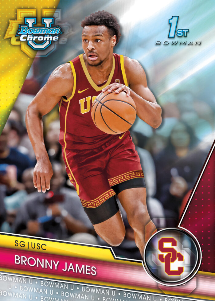
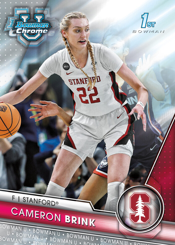
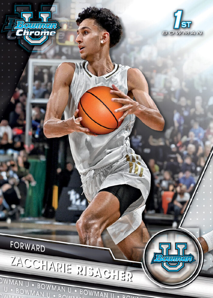
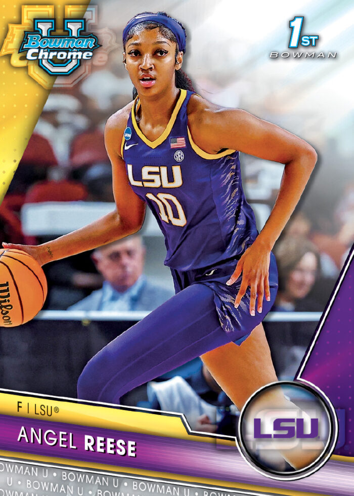
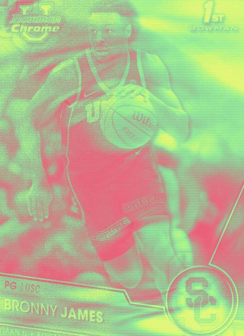
In the intricate process of crafting the 2023-24 Bowman U Chrome set, Schwartz takes us through the initial spark of wanting a design that pops. “We wanted to create a design that was dynamic and would show off the players, team colors, and team logos,” he emphasizes, setting the stage for an aesthetically striking and engaging experience for collectors.
The early stages of conceptualizing the design elements were marked by a commitment to resonate with college sports fans. Schwartz articulates, “We wanted to come up with exciting designs that the fans of college sports will love. We wanted to use dynamic shapes and use as much color as we could to make the designs come alive,” underlining the dynamic and colorful approach to capture the essence and excitement of collegiate athletics.
Balancing innovation with tradition proved crucial, especially considering the multitude of teams in college sports. Schwartz acknowledges this challenge, stating, “There are so many teams in college sports, so making sure that the team colors were clearly represented on all cards was something we wanted to execute.” This commitment to representing team colors becomes a homage to the identity and spirit of each university.
The color palette played a pivotal role in shaping the visual identity of the set. Schwartz elaborates, “We wanted to include team color as much as we could on these designs. There are many Universities across the sport that their team colors are part of their identity, for instance, the Duke Blue Devils, their fans’ Bleed Blue.'” This dedication to team colors becomes a nod to the unique identity of each institution.
Family Time
Ensuring that the design captures both the players’ essence and the sport’s excitement was paramount. Schwartz explains, “We wanted to allow the design to have a large image area so that the players are the star and are the first thing you see when you are ripping packs.” This emphasis on a large image area ensures players take center stage, heightening the thrill of opening packs.
Distinctive printing techniques, particularly the use of Schwartz’s favorite, Chrome Tech, played a significant role. “These are printed on Chrome Tech, which is my favorite tech we use. The shiny substrate allows the players to really POP!” This choice enhances the visual impact, making the players truly stand out.
Amidst the narrative of design considerations, the integration of the dual card featuring Bronny and LeBron James stands out as the crown jewel of the set and a poignant tribute to familial legacy within the basketball world. Crafted by Topps Senior Creative Director Jeff Zachowski, this card encapsulates the essence of two generations of basketball greatness. “Our team is always trying to create cards that not only reflect a player’s athletic prowess but also resonate with fans and collectors,” says Zachowski. The LeBron-Bronny card isn’t just about skill; it’s a nod to family legacy, and the team crushed it using superfractor foil to make it one-of-a-kind fancy.
New Juice
Aside from the Bronny and LeBron dual, Schwartz highlights standout features within the set, including the Sharp Shooters Subset. “One of my favorite designs in the set is the Sharp Shooters Subset. It really stands out against the rest of the set because of its retro almost Allen & Ginter Style,” he shares. Another intriguing insert, the Prodigal Playmakers, is described as “a simple design that’s meant to look like a coach’s clipboard with a play drawn up.”
The Topps team provided a holistic understanding of the meticulous design process that breathed life into the 2023-24 Bowman U Chrome set. Each quote reflects a deliberate choice, ensuring a harmonious blend of tradition and innovation, capturing the essence of players, the spirit of the sport, and the dynamic nature of college athletics.
