Looking at Classic Topps Football Set
The upcoming reemergence of Topps into the football card space gives vintage collectors the warm fuzzies, remembering the classic designs the company unveiled going back nearly 70 years to the inaugural 1956 set.
Then, it was critically important for each new set of cards to look completely different. The last thing kids wanted was last year’s cards, which were viewed as disposable. This constant rebranding of the product every year makes each set instantly recognizable. Some of these designs are more timeless, and some are firmly of their time.
Pleasing to the Eye
Picking the best football set design of the 1950s — or any decade — is subjective. Do you want something more appealing to the target audience, which then was only children? Or do you prefer something more along the lines of modern American art?
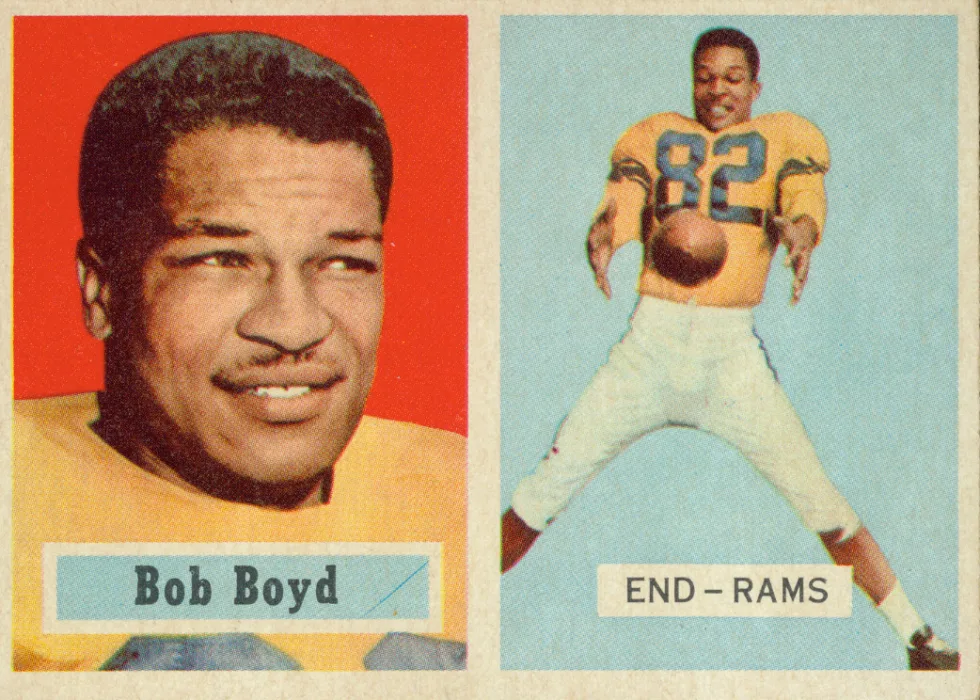
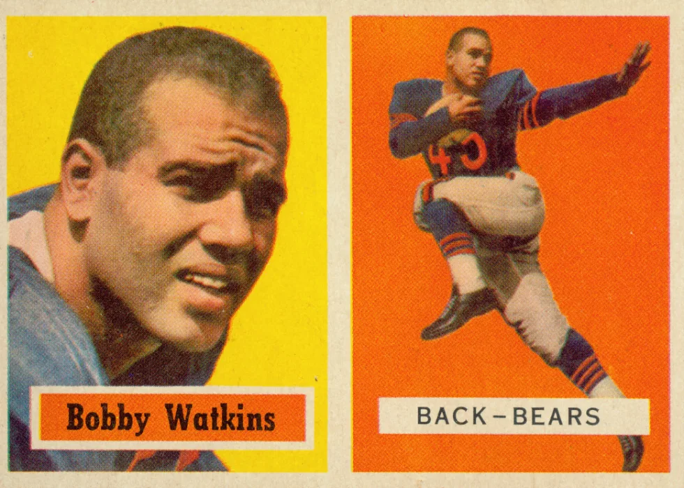
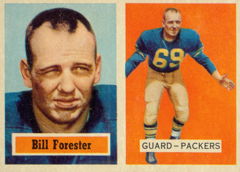
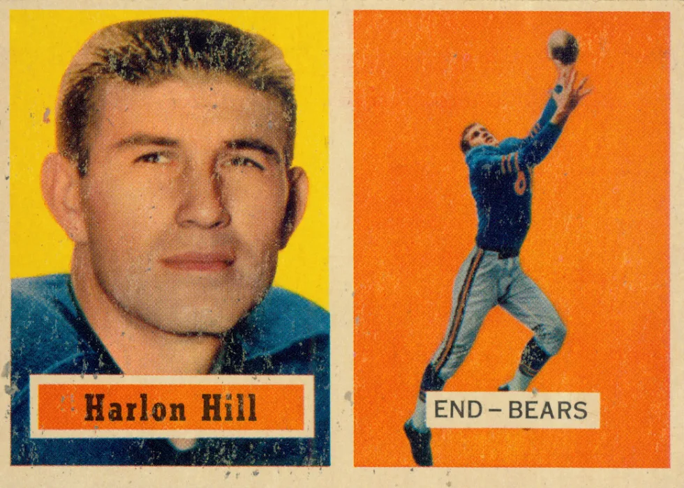
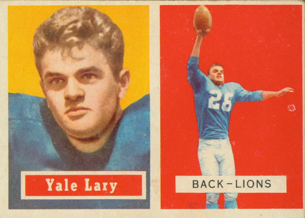
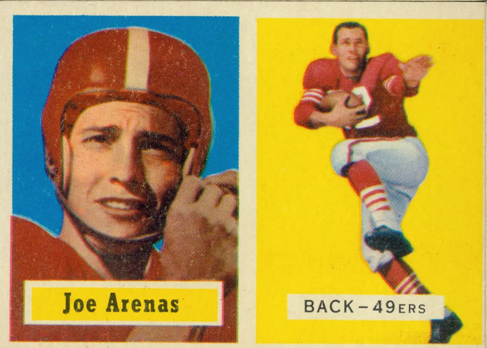
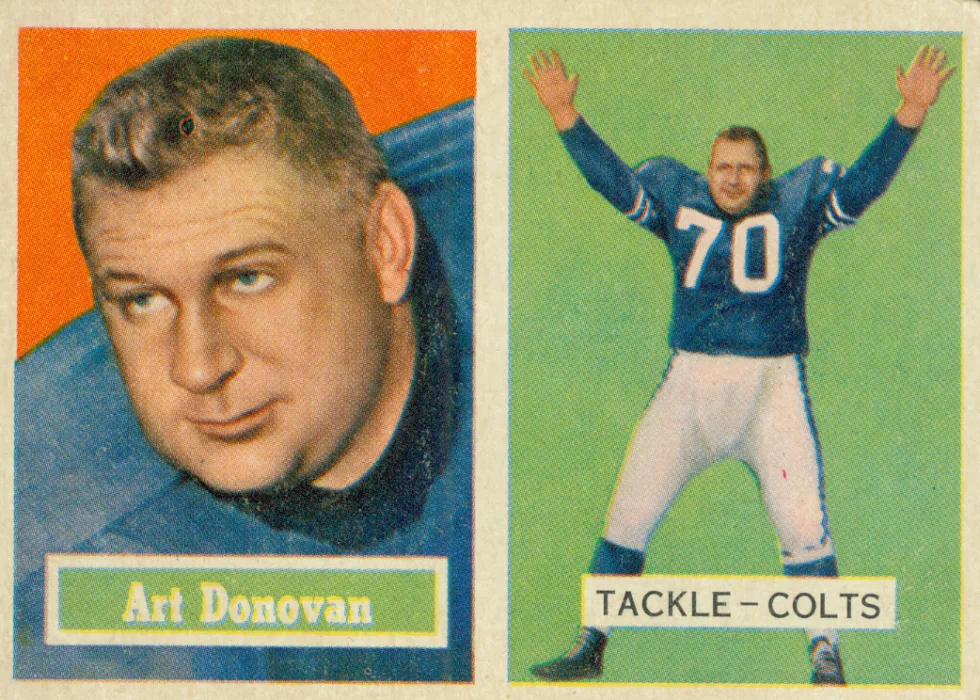
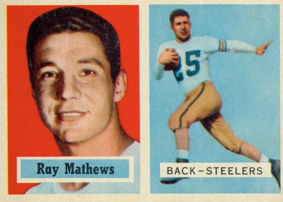
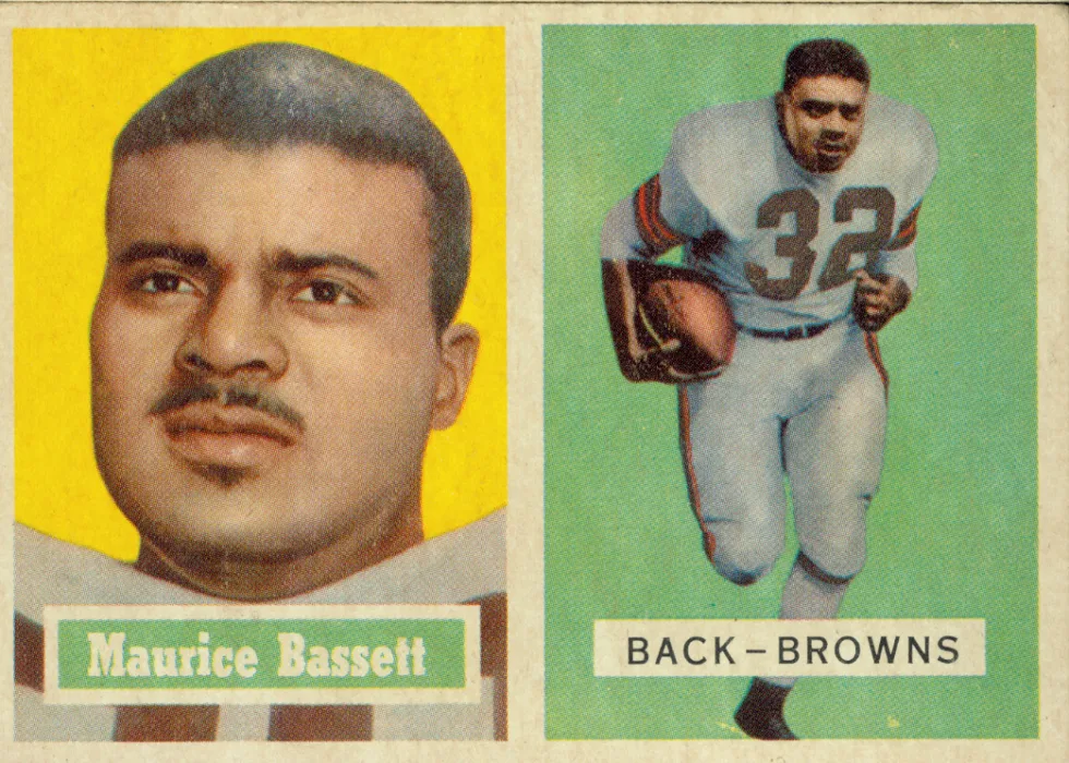
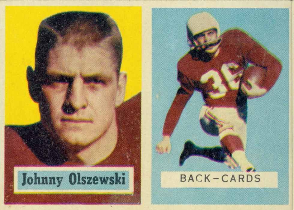
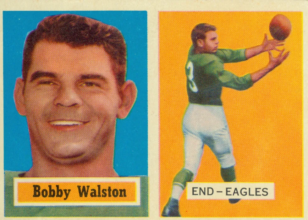
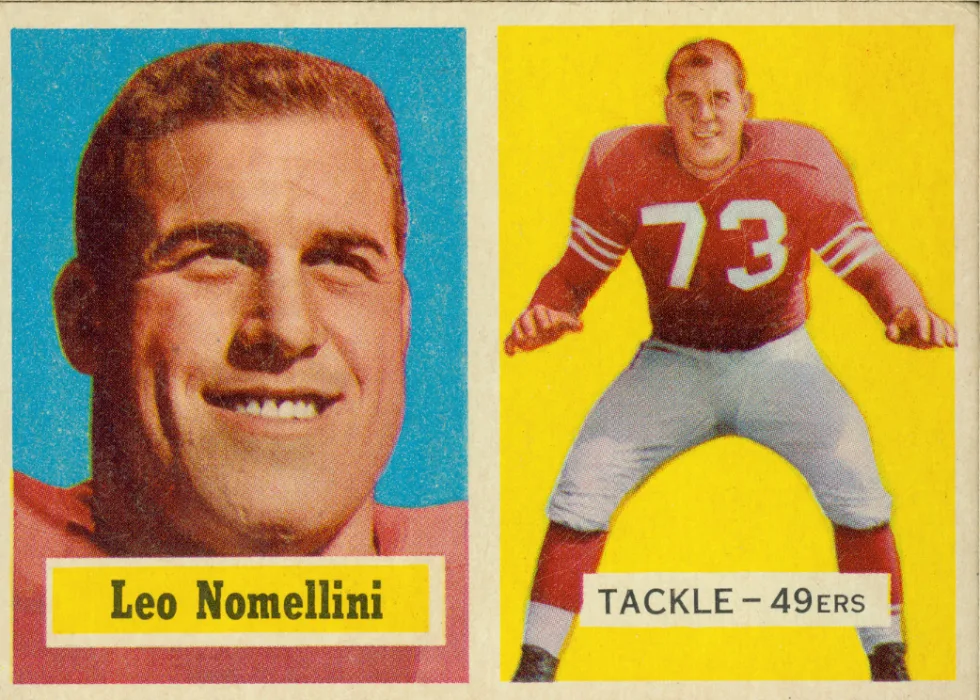
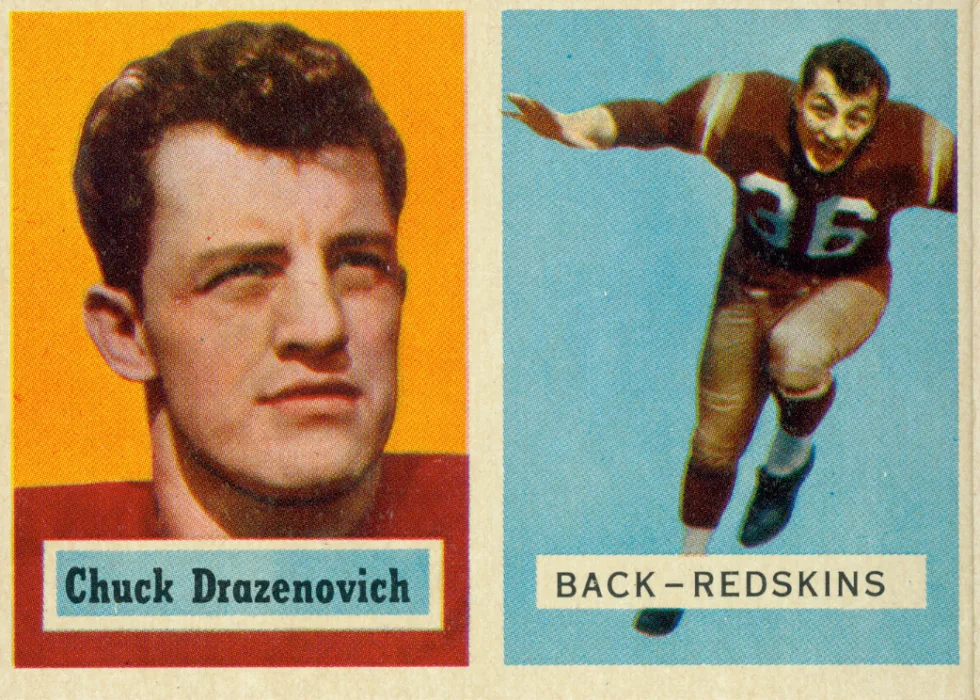
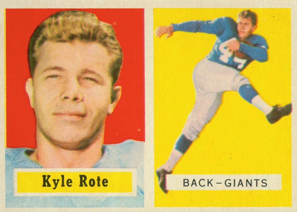
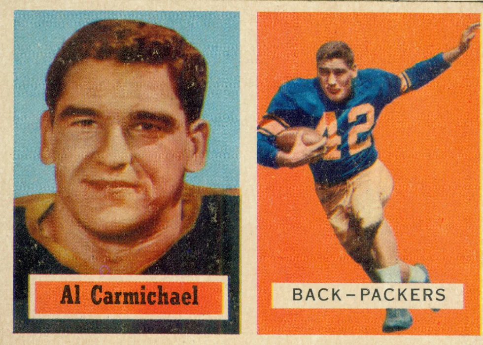
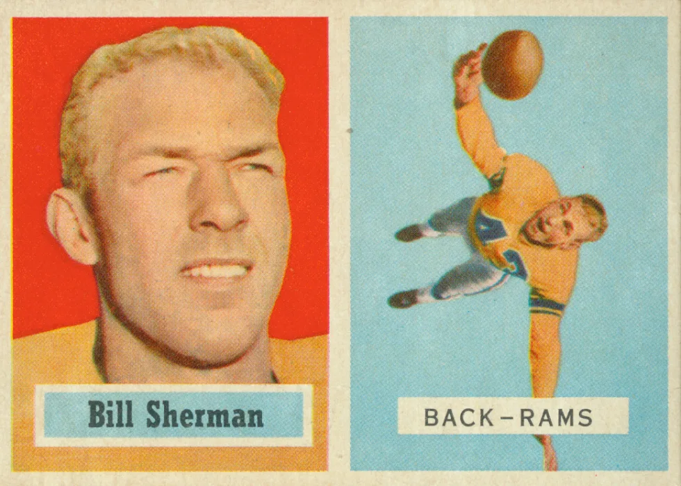
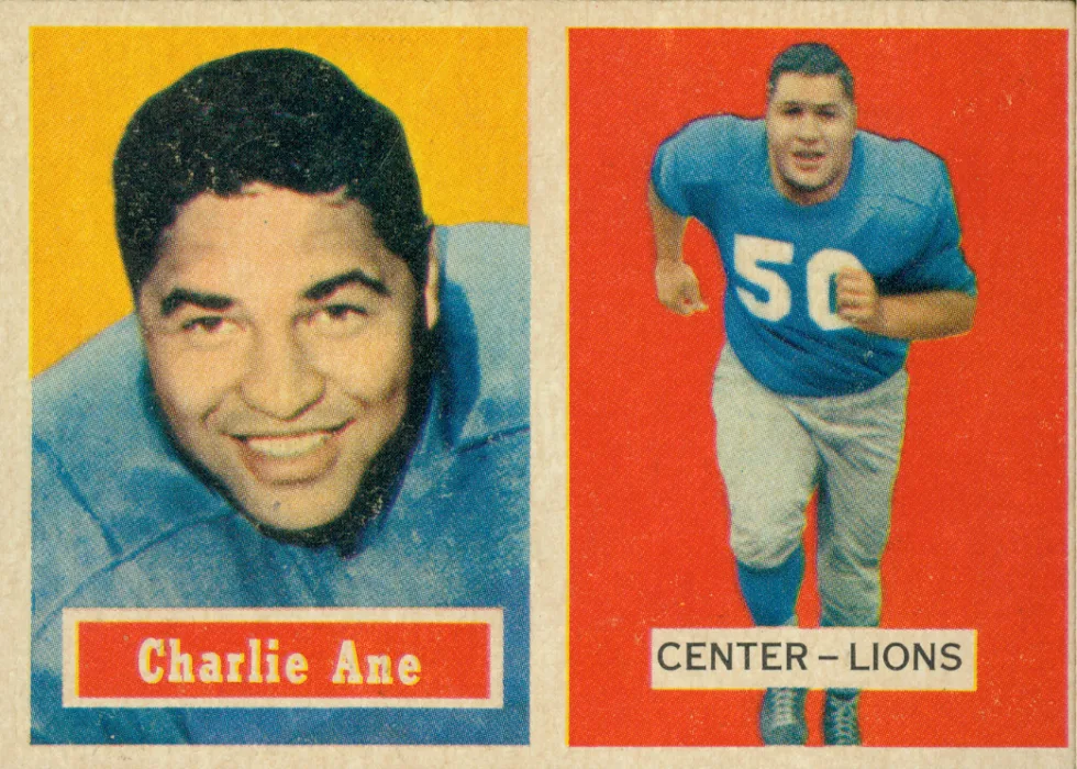
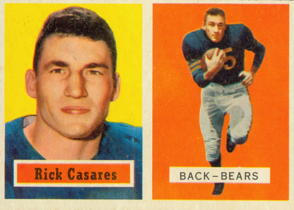
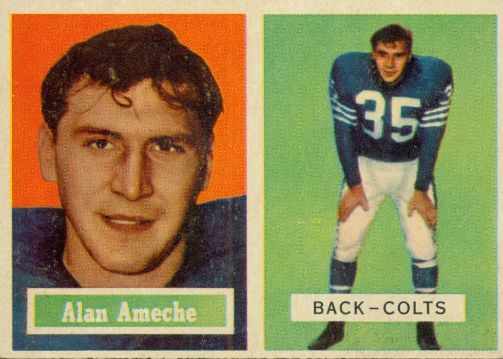
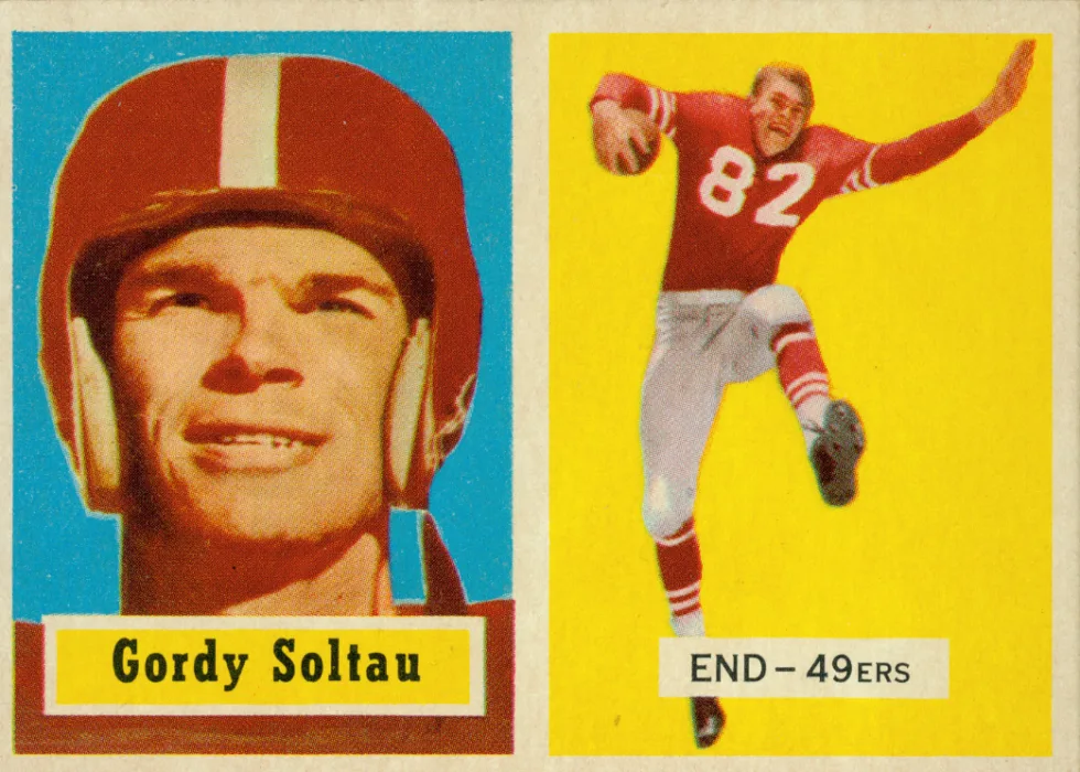
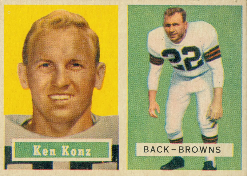
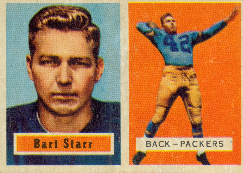
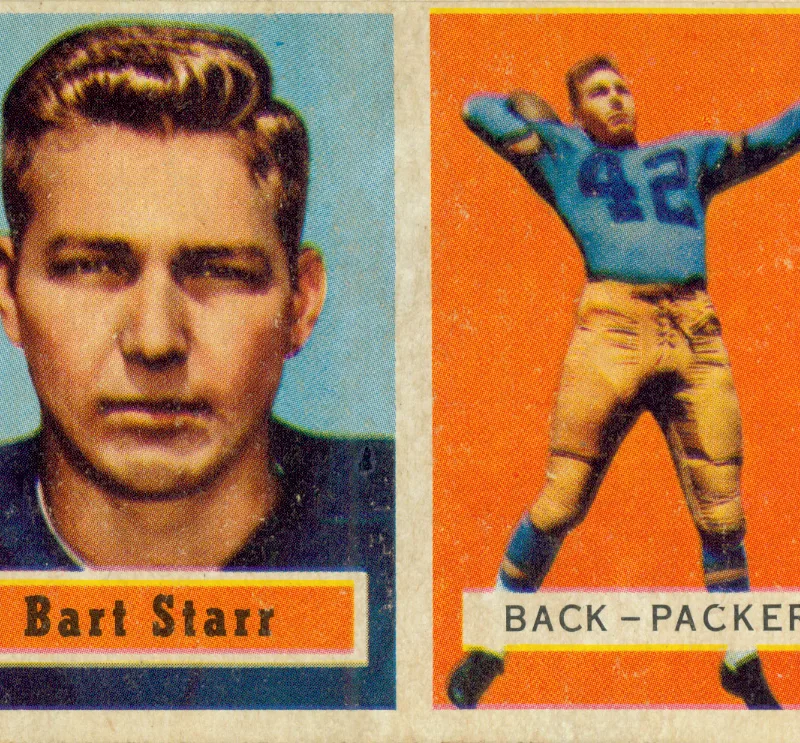
My pick for the best 1950s design falls into the latter category. The 1957 card fronts are clean, simple. For the third time in its history, Topps used a horizontal design. The fronts were symmetrically separated, with a headshot of the player and an action pose. The headshot on the left included a box with the player’s name. The action shot pose on the right side noted the player’s position and team. On well-centered cards, the white border separating the photos is the same width as the border around the edges of the card. The effect is striking.

“Coloring the black and white photos is a tedious process,” Topps Senior Art Director John Doldan said. The result is something between a photo and a painting. Doldan added that the design used different fonts and boldness. The objective on the left, he said, is to draw your eye to the more staid headshot side. On the right, it’s relatively low-key so as not to detract from the attention-getting action poses. “It was very intentional,” he said. Doldan also noted that the colors complement each other in reverse on both sides and mirror the player’s uniform colors. “They used colors that are very pleasing to the eye.”
Mini Time Capsules
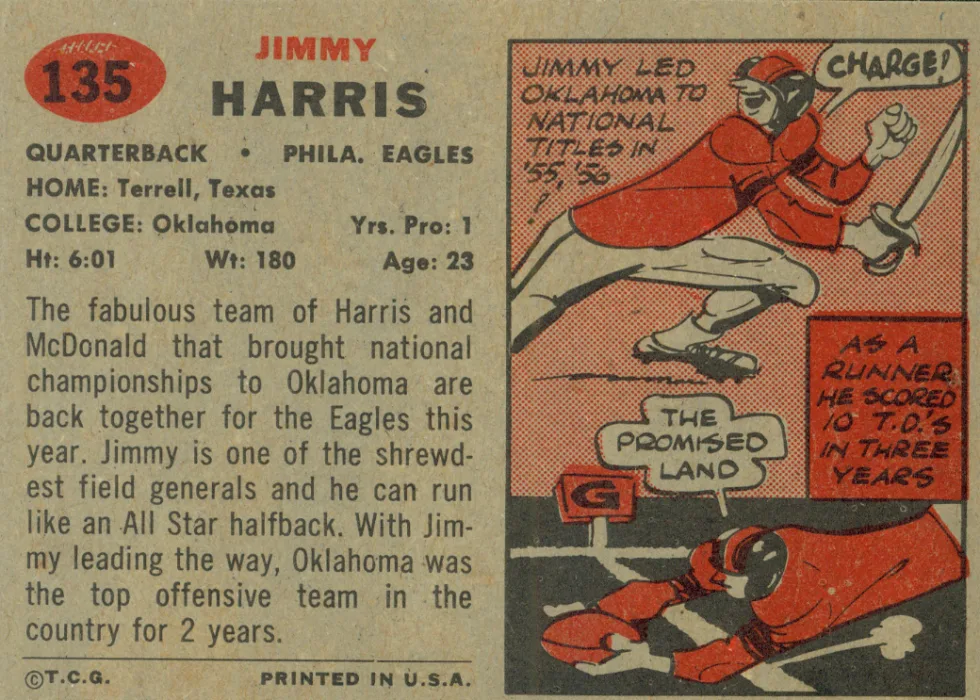
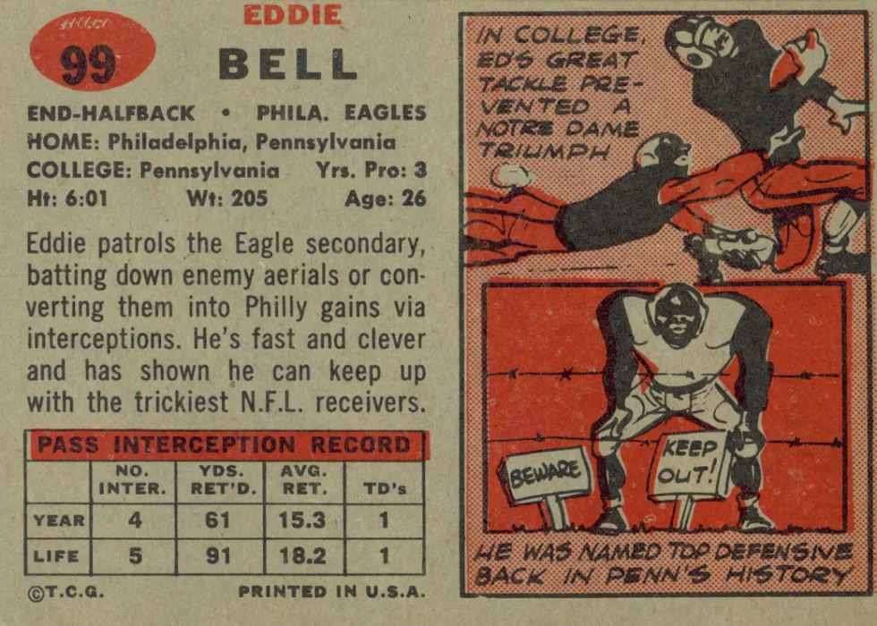
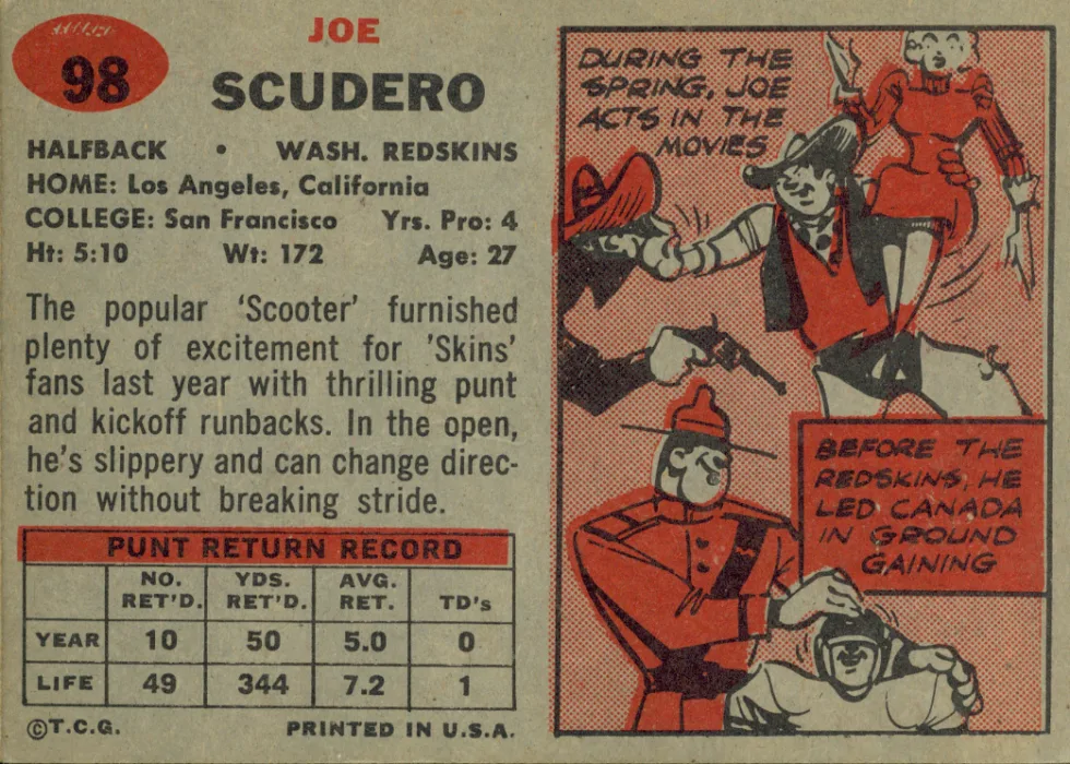
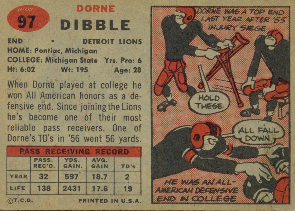
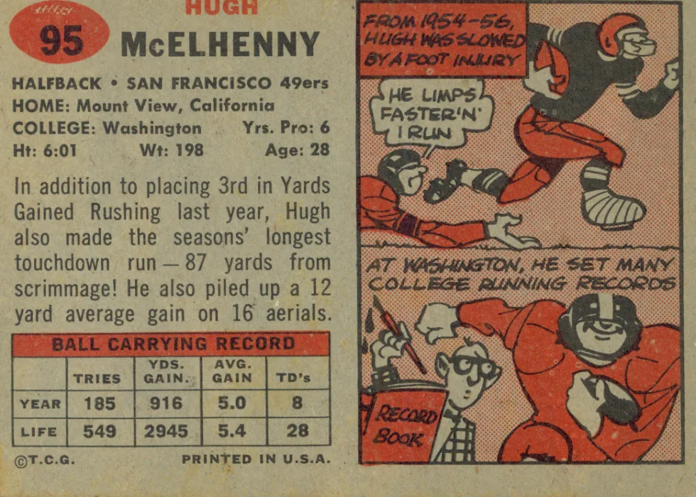
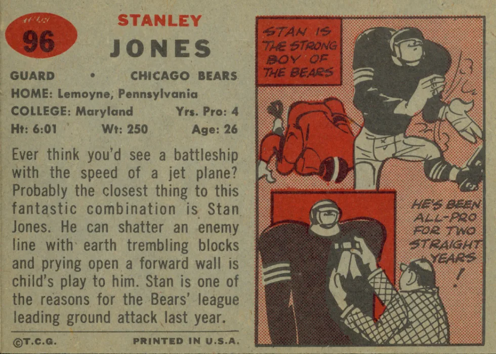
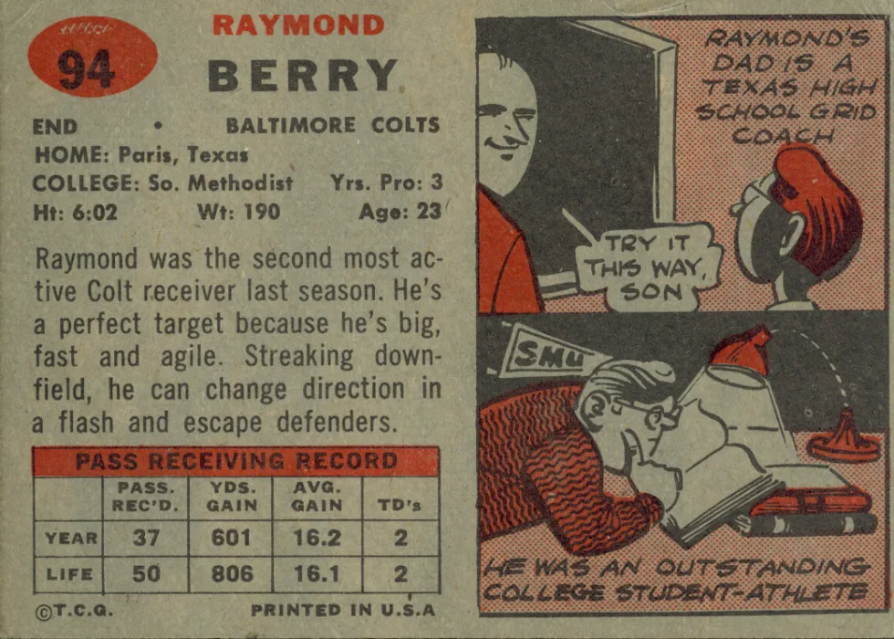
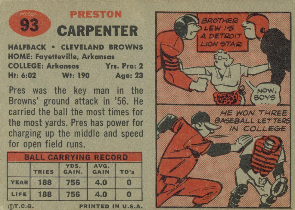
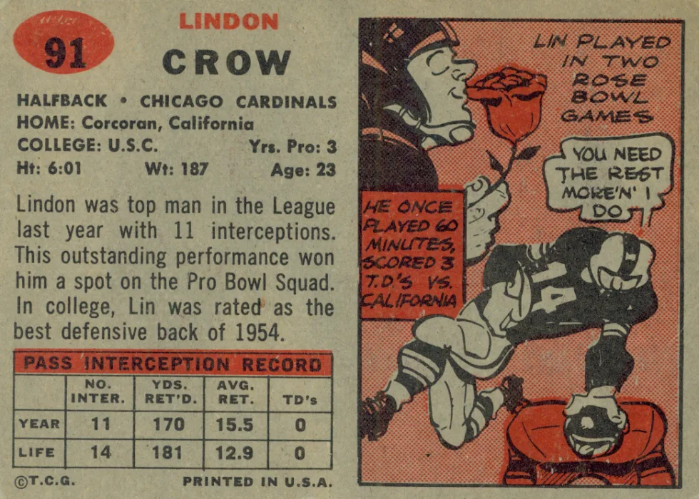
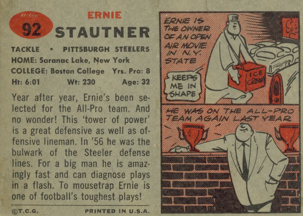
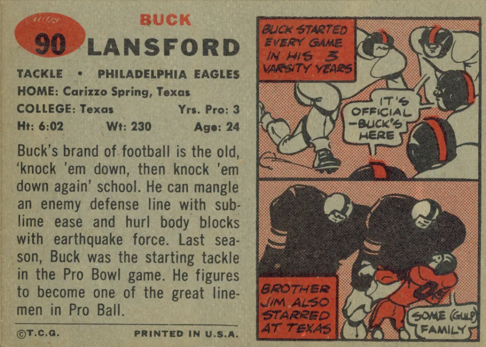
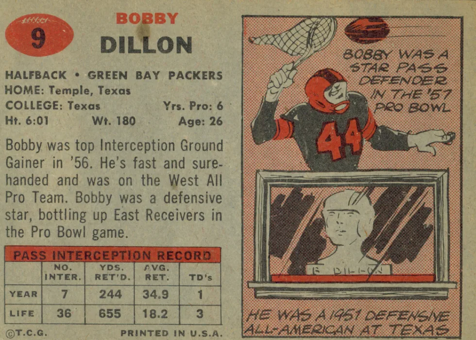
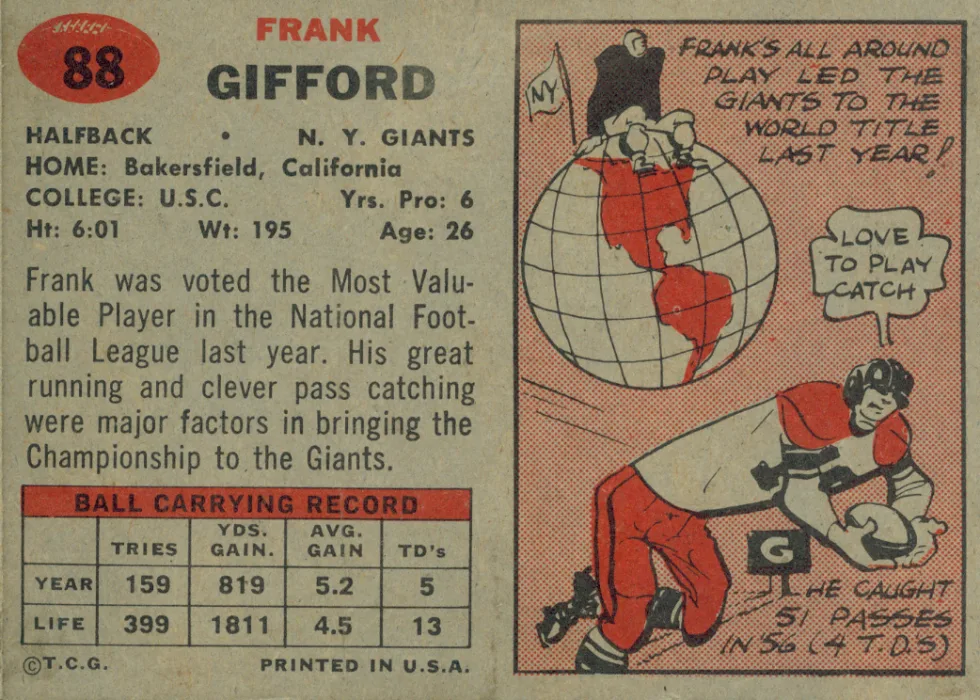
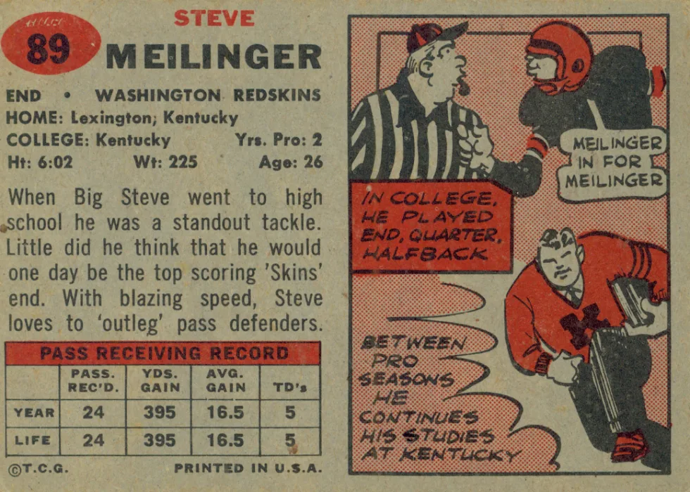
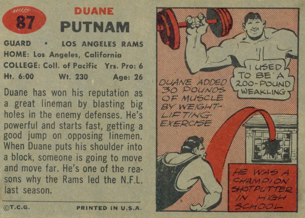
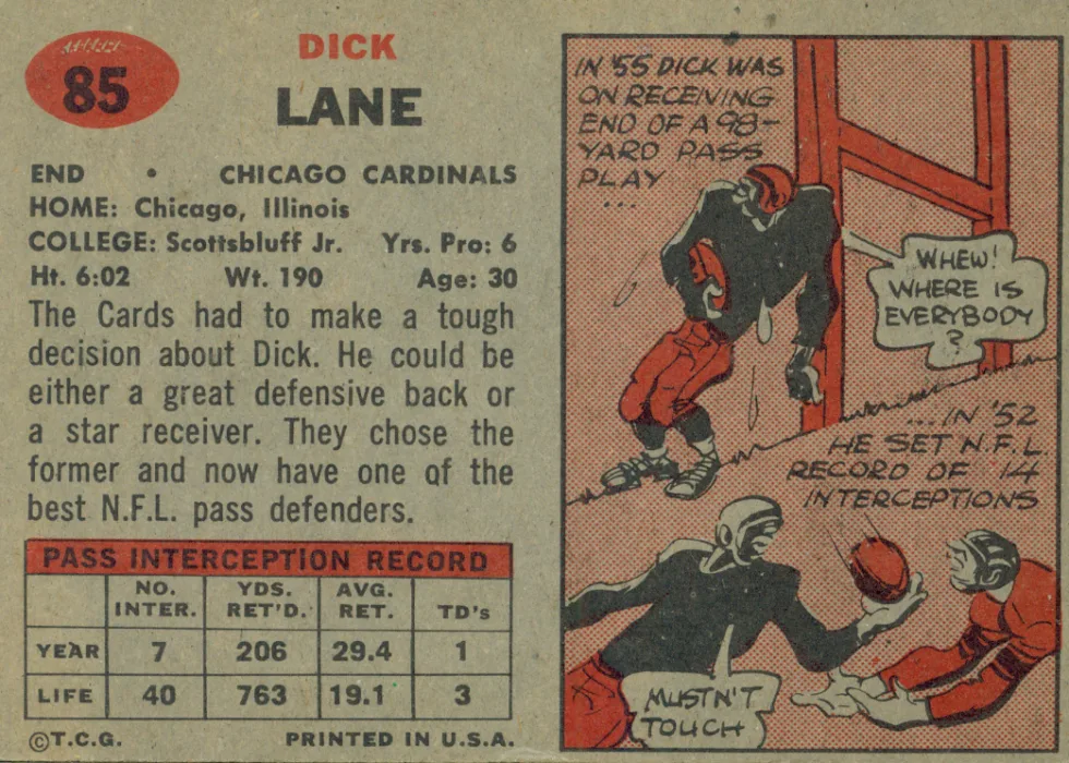
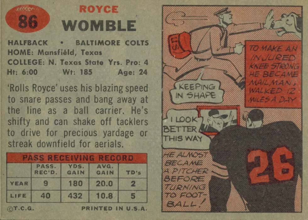
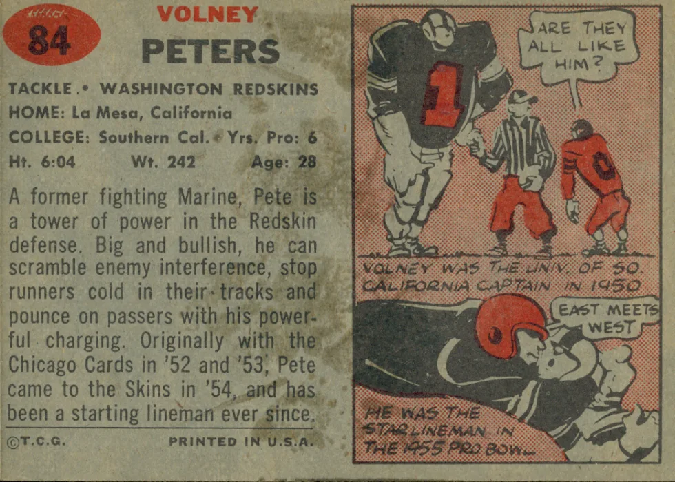
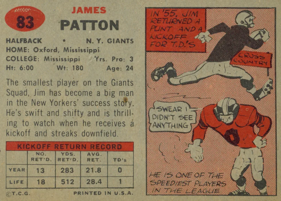
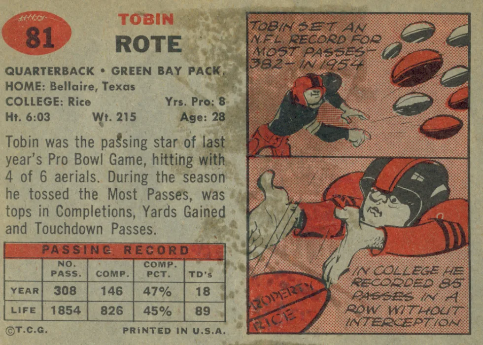
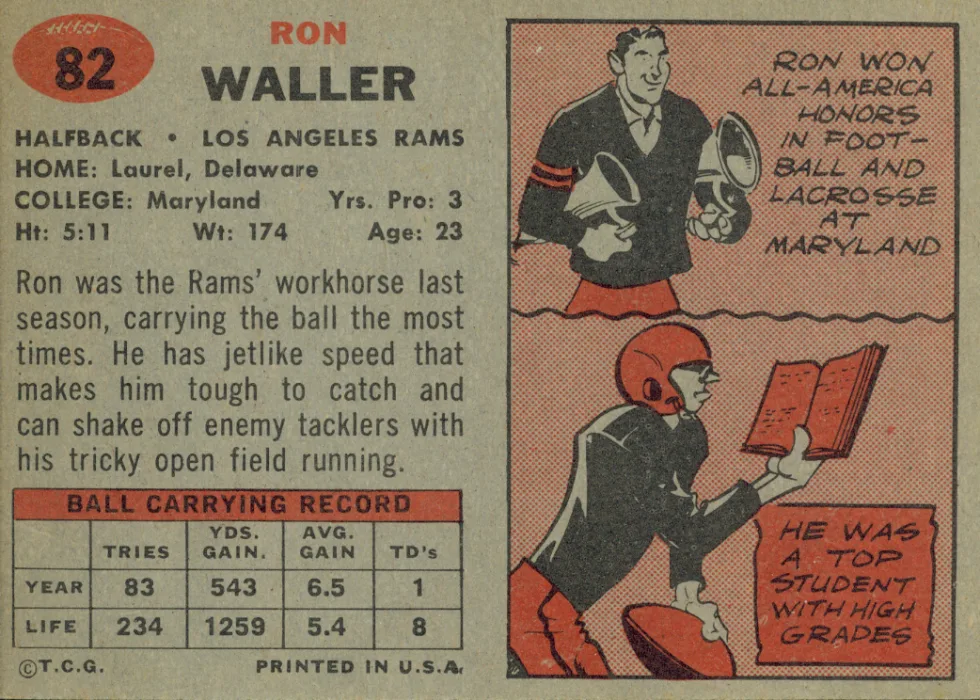
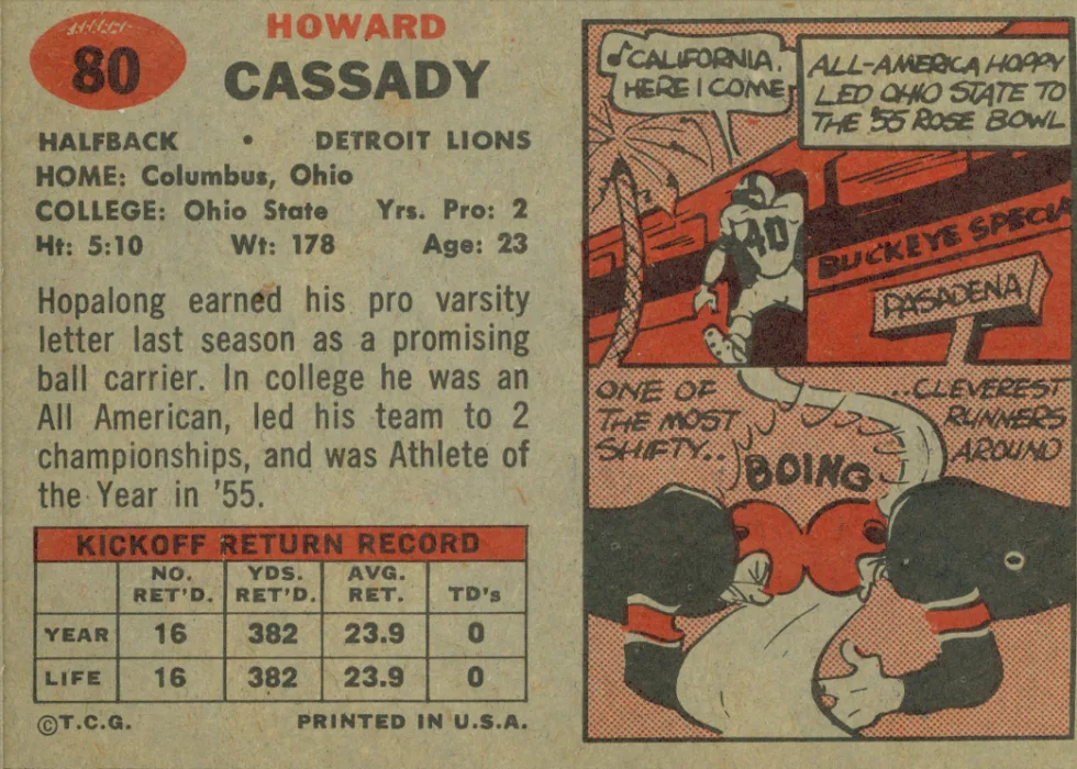
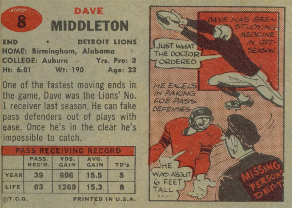
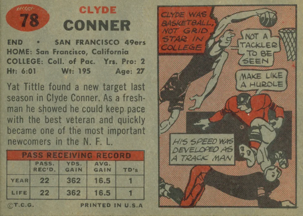
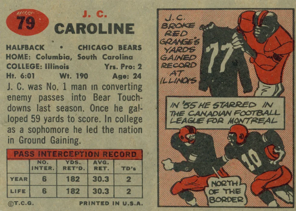
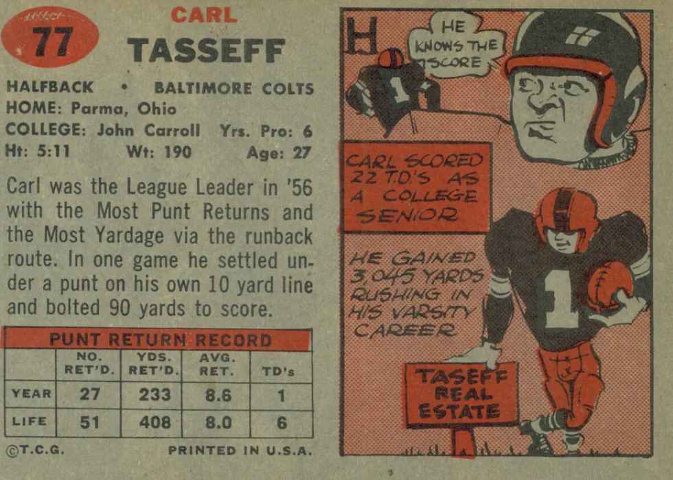
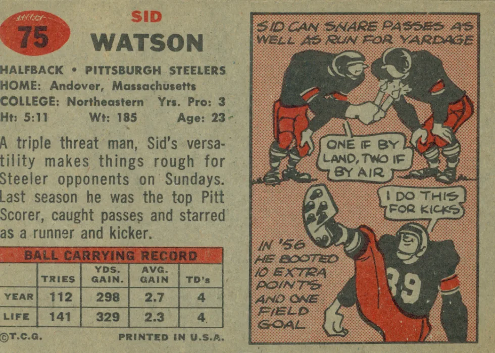
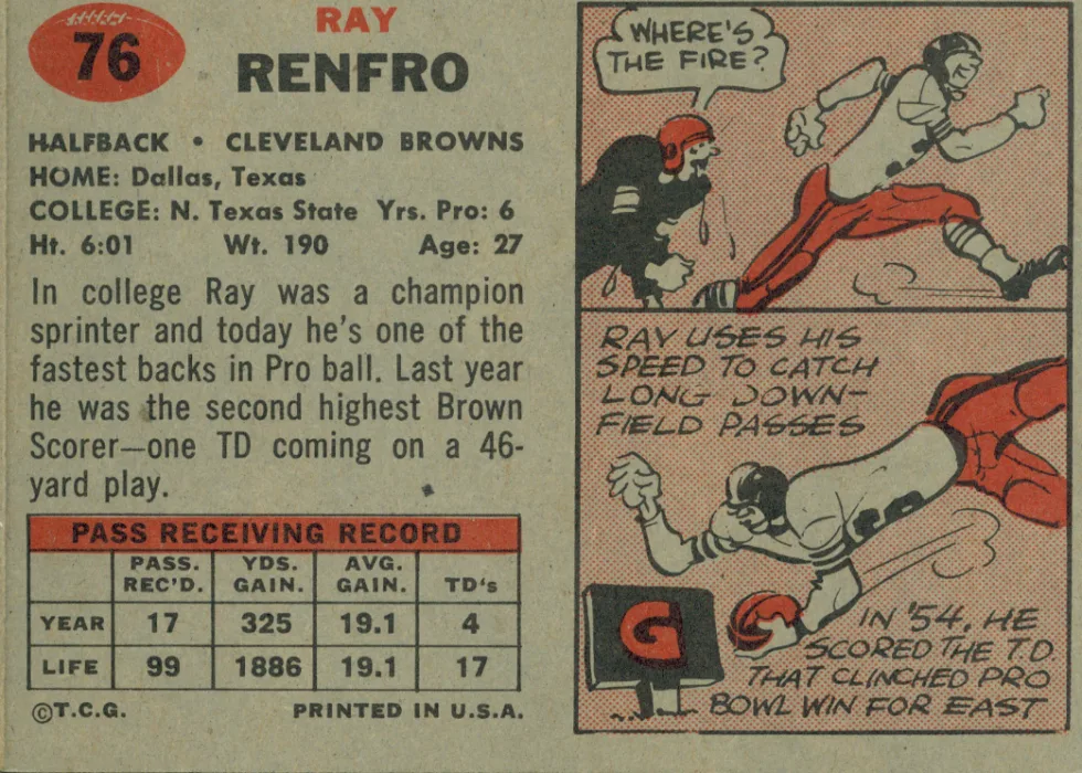
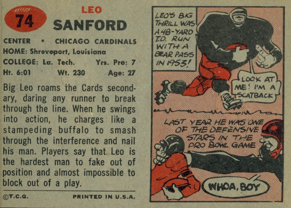
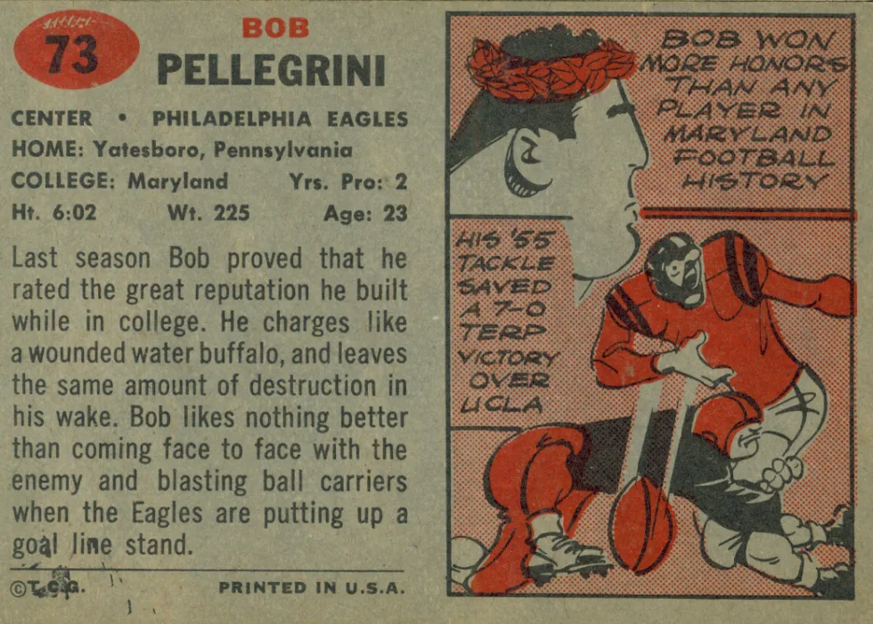
The card backs are similarly split in half, with player biographical information and a summary of their skills and productivity on one side — the left — and two cartoons with more personal biographical information on the right. The images are comic-book style.
The copy side of the card back also includes prior season and career stats for skill players. Ball carriers and receivers get tries/receptions, yards, average gain, TDs. Attempts, completions, completion percentage and TDs are noted for QBs. Defensive backs had interceptions and return data detailed.
The written descriptions provide insight into yesterday’s game. QBs were field generals, tasked with calling “the right play at the right time.” (Coaches generally did not call plays.) Fullbacks were praised strictly for their running “up the middle or skirting around the ends.” Halfbacks (who were half runners/half receviers) had their receiving ability described. The tight end position didn’t even exist.
Cartoons provide not only biographical information about the man behind the player, but also are a window into the times in which they lived.

“The (now standardized) 2.5-inch by 3.5-inch design was smaller than the 1956 Football set and the prior Baseball sets,” Doldan said. “It mirrored the size of the 1957 Baseball set. The double photo was something that was only done one other time, in 1962.”
Topps seemed determined to pack as much as they could on the smaller-sized card — double photo, player data and bios, player stats (for skill players) and even double cartoons. Somehow, they did all this with a clean rather than cluttered look.
